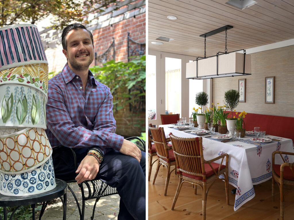
We have been enamored by Ross Alexander’s distinctive design style for creating lush modern interiors full of character and personality with dynamic color, floral patterns, antiques, and the finest quality handcrafted pieces. A graduate of the New York School of Interior Design, Ross has worked at some of the country’s most prestigious interior design firms, including Robert Couturier, Robert A.M. Stern Architects and Charlotte Moss, before starting his eponymous own studio, Ross Alexander Designs in 2019. “Growing up next to a botanical garden…nature is the keystone of my aesthetic” says Ross, which is evident in his design for interiors as well as custom murals, wallcoverings, rug collection and bespoke line of hand painted lampshades.
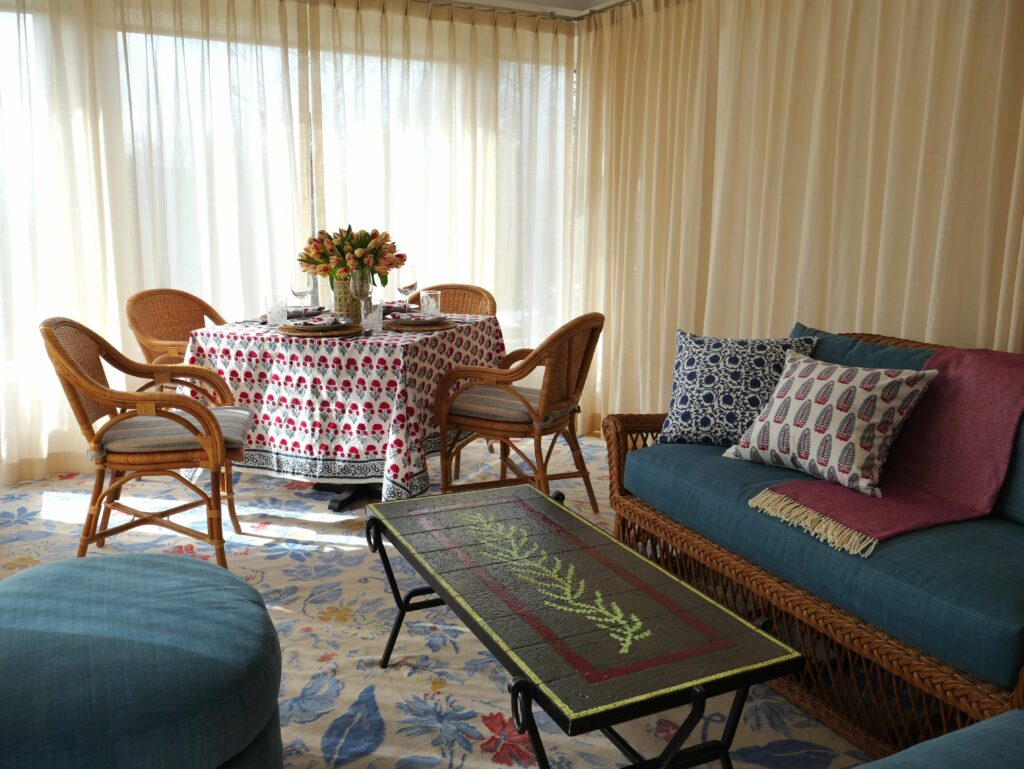
We are pleased to have Ross as our Style Guide, where he uses several heritage Indian botanical designs from Marigold Living including Nargis, Anna and Hana table linens, and Lotus-Yasmin reversible pillow covers, in his client’s beautiful house in the Hudson Valley inspired by the Mid-Century Swedish interiors of Josef Frank. Ross’s significant breadth of knowledge of the decorative arts, craftsmanship and historical reference are reflected in his work , which we find very inspirational. At Marigold Living, we create our block print collections for modern living with an eye towards the rich history of Indian design that has stood the test of time, using centuries-old techniques of fine craftsmanship India is known for – and it is rewarding to see our designs fit so beautifully in the lovely interiors designed by Ross.
Ross shares his expertise on how to select and layer colors and patterns cohesively from varied cultures and periods to create interiors with depth. “Different patterns and colors can easily work together when using the same hue but different tonalities” says Ross, along with his tips to “make even a simple lunch more festive” and “keeping flower arrangements dense but simple for high impact”. Read our Q&A below for more guidance and thoughtful pointers from Ross to fuel your own creativity and emulate his refined aesthetic.
Enjoy the walk around this Hudson Valley dining room and the sunroom, highlighting Marigold Living pieces in this short clip below:
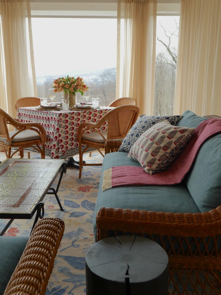
House designed by Ross in the Hudson Valley
“I was inspired by the Mid-Century Swedish interiors of Josef Frank; Clear, cheerful colors mixed with lively prints”
Q: Where was this project and what was your inspiration for the design?
A: This house is in the Hudson Valley, set within a beautiful landscape. I was inspired by the Mid-Century Swedish interiors of Josef Frank; Clear, cheerful colors mixed with lively prints, wicker furniture, all against a light architectural backdrop.
How our heritage Indian designs fit with Ross’s décor style
“Growing up next to a botanical garden…Flora is incorporated into every aspect of my work. Layering materials from different cultures or periods adds depth to an interior”.
Q: How do our heritage Indian designs fit with your décor style?
A: Nature is the keystone of my aesthetic; Growing up next to a botanical garden I spent a lot of time studying different flowers and plants. Flora is incorporated into every aspect of my work, whether through carpets, upholstery, or wallpaper. I also love layering objects and materials from different cultures or periods as it adds a further depth to an interior.
Guidelines for making so many different patterns, colors and textures work together
“…using the same hue but different tonalities…The patterns themselves also balance one another.”
Q: At Marigold Living we are all about the mix. Here you have used table linens from three different collections of ours and made them look so cohesive. Do you have any recommendations on what one should keep in mind when selecting patterns? Any rules or guidelines that one should follow to make so many different patterns, colors and textures work together?
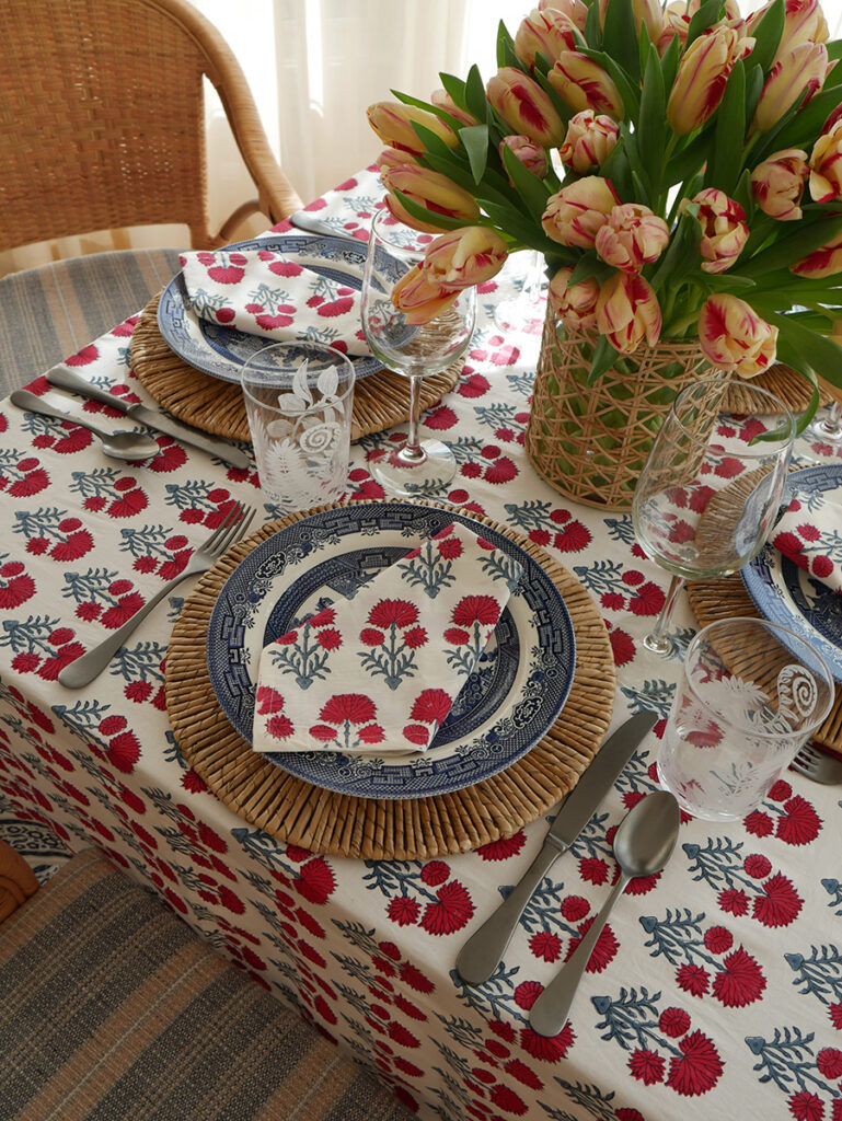
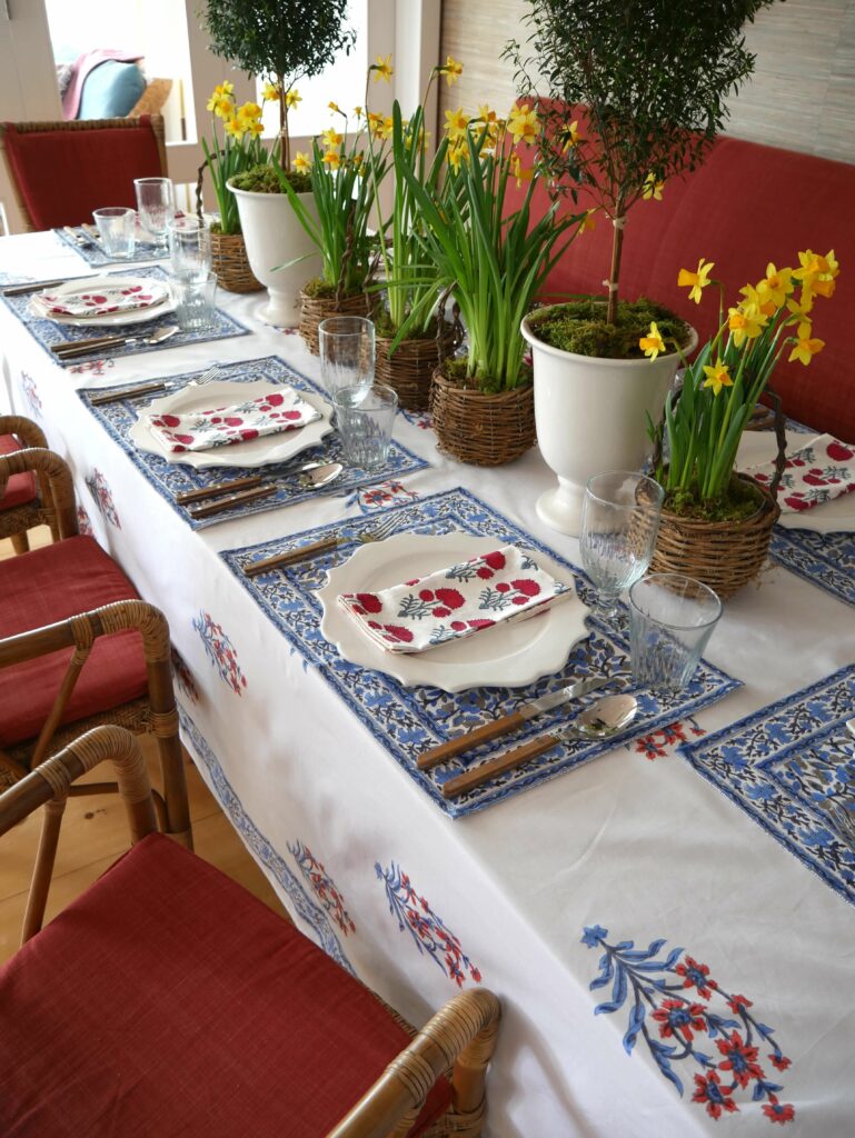
A: Different patterns and colors can easily work together when using the same hue but different tonalities. I like to create tablescapes and interiors that use two, maybe three colors in varying shades. On the larger dining table, I focused on varying shades of reds and blues, yellow is an additional punch of color. The patterns themselves also balance one another; The gorgeous placemats have a dense, meandering pattern so I balanced this with napkins that have a stylized motif. The larger scale, and more open design of the tablecloth adds a contrasting element.
“Color always adds a lot to the table and makes even a simple lunch more festive“
“I look for colorful prints that have a detail to the design. The linens should also have a visual balance…”
Q: As a designer, what do you gravitate towards when sourcing linens? What do you look for?
A: I look for colorful prints that have a detail to the design, whether through decorative borders, embroidery, or an interesting design repeat. I don’t use a lot of solid linens or neutrals as color always adds a lot to the table and makes even a simple lunch more festive. The linens should also have a visual balance, so I’ll use a placemat with a more dense pattern, and combine this with a tablecloth or napkins that have a larger scale.
When it comes to table styling – the more layers the better
“I always use a tablecloth as it adds a softness to the space and feels more luxurious. It’s also fun to mix different prints…and I love to incorporate wicker.”
Q: What’s your approach when it comes to table styling? Do you have any must-haves?
A: The more layers the better – I love using a tablecloth then adding a contrasting, secondary textile draped across the table. I always use a tablecloth as it adds a softness to the space and feels more luxurious. It’s also fun to mix different prints, large-scale florals, in a single color, with smaller, more detailed napkins in an array of one color. Wicker is one of my favorite materials, and I love to incorporate wicker baskets, placemats, or serving containers.
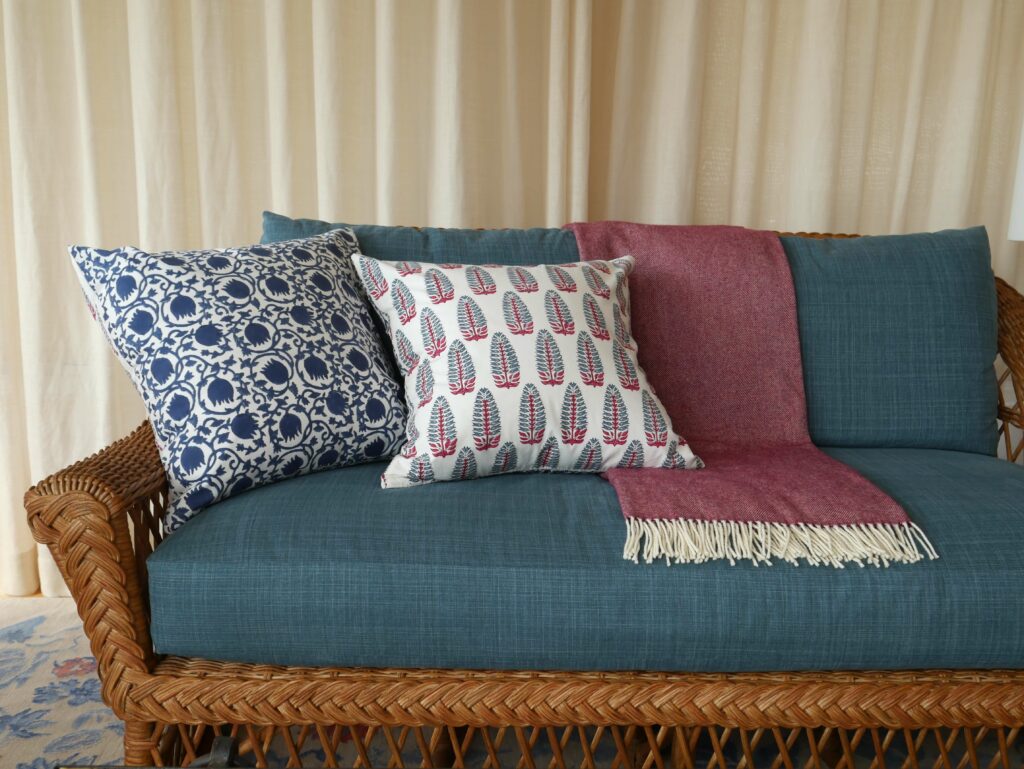
“The two designs (in the reversible Lotus-Yasmin pillow covers) are very different from one another yet complementary…and add the perfect detail to the solid fabric on the sofa“
“There is also a charming dialogue between the pillows and the area rug I designed in terms of color and scale.”
Q: We love how you chose our reversible Lotus-Yasmin pillows for the wicker sofa – why did you choose these block printed designs?
A: The two designs are very different from one another yet complementary; I love how the Lotus design meanders and the Yasmin Tuberose print is more stylized. The patterns add the perfect layering of detail to the sofa upholstered in a solid fabric. There is also a charming dialogue between the pillows and the area rug I designed in terms of color and scale.
Some great tips on selecting and styling florals more elegantly at home
“…keep it simple – for daytime lunches a table set with a dense arrangement with one flower can be impactful. For a more formal dinner, it can be quite fun to use smaller vases that can be scattered around the table. Find a beautiful container…”
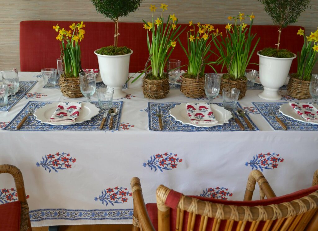
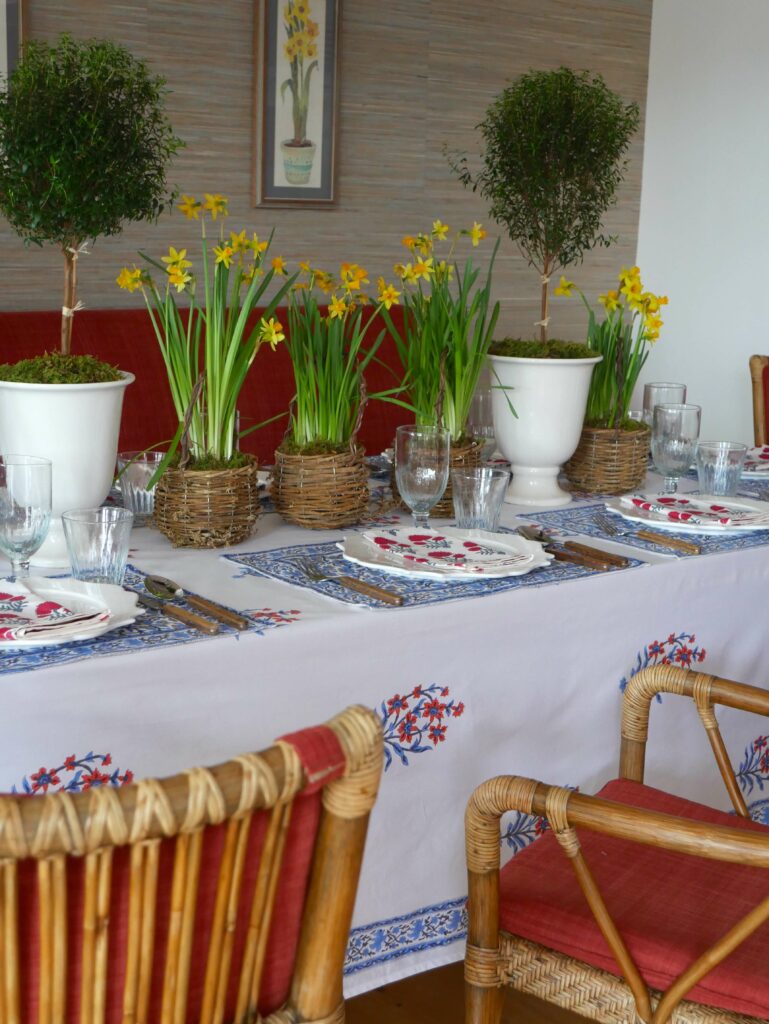
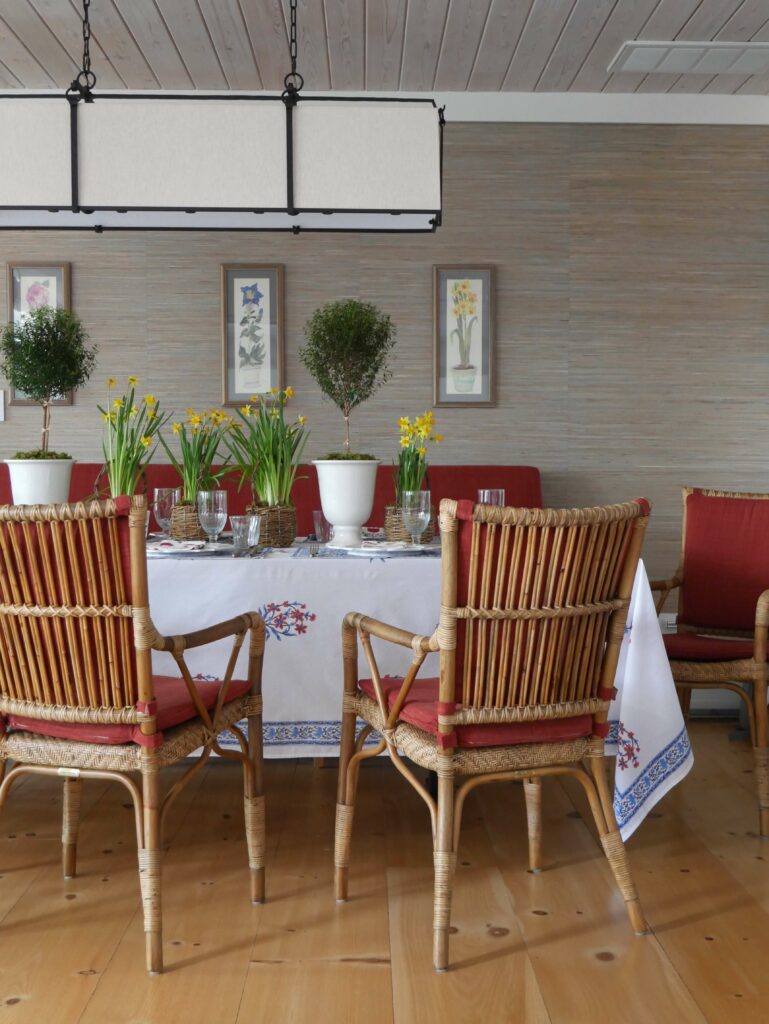
Q: So fun to see how you styled one of the tables with bright yellow daffodil plants. How do you go about sourcing florals? Can you share some ideas on selecting and styling florals more elegantly at home?
A: I love going to the flower market here in the city, there is a wonderful array of flowers for every season. When creating arrangements, I keep it simple, one, maybe two different types of flowers max. Glass containers won’t do, find a beautiful basket, antique vase with an interesting profile or ceramic glaze. The container is half of the impact! For daytime lunches a table set with one flower, for example, all Zinnias or all Hydrangeas grouped in similar tones can be impactful. The more dense the arrangement, the better. For a more formal dinner, it can be quite fun to use smaller vases, maybe blue and white vases with Ranunculus, that can be scattered around the table. This allows the guests to see over the arrangements and the arrangements won’t take up too much table space.
It’s all about the layers for a fancier table setting!
“The addition of candles; napkins with an embroidered detail; adding a textile over the existing tablecloth…”
Q: Do you have any tips for taking a table from a more daytime, casual feel to a slightly fancier setting?
A: The addition of candles, whether through votives, candlesticks, or hurricanes can be impactful. I also love to simply change the napkins to something a little bit more elaborate with an embroidered detail, and folding them in either an Angled Pocket or a Double Diamond. It’s fun to add a textile over the existing table cloth for another layer. It’s all about the layers!

Leave a Comment